


Three ingredients for great flyers « Back to list
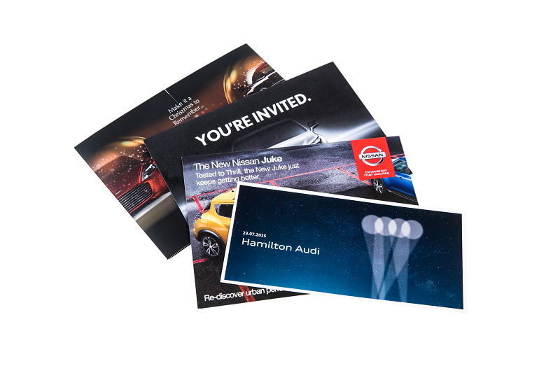 A staple of marketing and print advertising, flyers advertise products, services, deals, events and businesses throughout Ireland. Whether you’re an experienced designer or advising customers on print and design, it’s always worth looking at why flyers succeed – or fail.
There are three main ingredients for good flyer design. They may sound obvious to experienced designers, but they’re definitely worth remembering and putting into practice.
1. Attention-grabbing design
With so much competition, how will you make your flyer stand out? What is it that will make someone take a second look at your flyer? While great headlines are important, it’s likely that your eye will be drawn first to a visual element. It could be an illustration, striking image, use of colour and shape or attractive typography. It’s that attention-grabbing element that is essential in making your flyer serve its purpose.
At TradeDigitalPrint.ie we print a huge range of flyers as well as posters, pop-up stands, banners and other printed marketing for our trade customers. One thing common to all good design is a good focal point. What part of your flyer will the eye focus on? That’s usually where your most important information will be located. You can use colour, layout or a particularly striking image to draw the eye to your focal point.
2. Creative use of colour
Used correctly, colours will not just get your flyer noticed, but will engage people through their emotions and feelings. Warm colours like red and orange communicate warmth and excitement. Cooler colours like blue and green are used for more a more calming effect.
On a purely visual level, contrasting colours can really lend impact to your flyers. Or, depending on your message, you might find a more simple combination to work perfectly. A black and white design with one colour added can be very effective, especially when drawing the eye to your focal point.
3. Perfect balance
A flyer will lose all of its impact if the design is too busy or has too much information crammed into the available space. If you’re a designer you’ve probably had to explain this to clients while advising them to cut back on text. Often, people think that more information will help sell their message. However, the opposite is true. People won’t spend time sifting through complicated content and visuals to find the information they want. They’re more likely to ignore your flyer completely. Don’t be afraid of white space. It can be hugely effective in drawing the eye to your core message. Good, clean design and layout is much easier if you’re not trying to cram masses of content into the available space, so limit content to the most important information.
At TradeDigitalPrint.ie we supply thousands of flyers for our trade customers. Register online today to get 50% off your first order and free delivery. To see our full range of products, get instant quotes, order online or find out more about how TradeDigitalPrint can help you, simply visit www.TradeDigitalPrint.ie or contact our expert print team today.